Download free Domine Regular font | Domine-Regular.ttf
(0 vote)
Domine Regular font by Impallari Type. File script name Domine-Regular.ttf download free for Personal Use.
About Domine Regular font
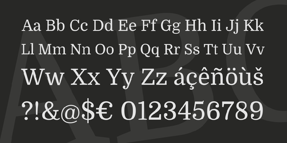
From the very first steps in the design process 'Domine' was designed, tested and optimized for body text on the web.It shines at 14 and 16 px. And can even be used as small as 11, 12 or 13px.
Harmless to the eyes when reading long texts.
Domine is a perfect choice for newspapers or magazines websites, where text is the main focus.
It's is friendly in appearance because it combines the classic elements of familiar typefaces that have been in use from more than 100 years like Clarendon, Century, Cheltenham and Clearface.
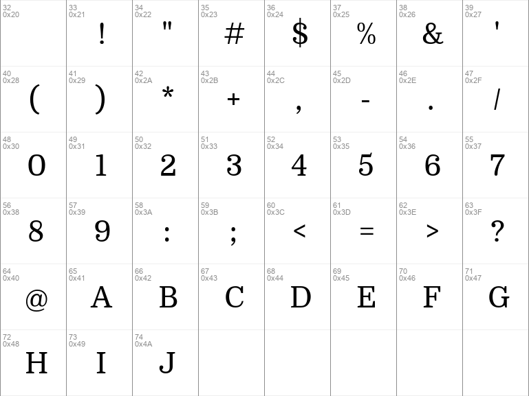
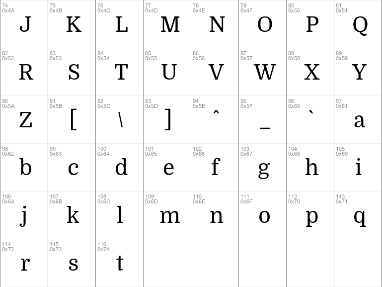
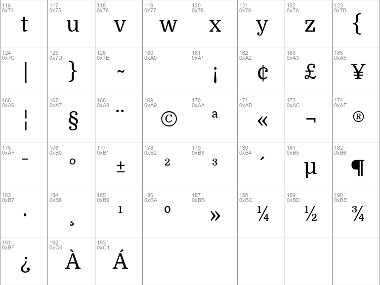
- The rounded letters (b, c, d, e, o, p, q) are a bit squarish on the inside. This feature opens up the counters for better rendering and also make it look a bit more up-to-date than the classic typefaces previously referenced.
- The serifs are a bit shorter than usual. Another feature that improves the rendering by allowing more "air" between each letter pair.
- The joins of the stems to the branches in letters like h, m, n are deep enough to prevent dark spots, also improving legibility at small sizes.
- The friendly lowercase 'a', with the curve starting from the bottom of the stem, is reminiscent of Cheltenham and Clearface. That soft curve is also echoed in the curves of the f, j, n, m and r.
- The spacing is also optimized for body text on the web, clearly more open than that of typefaces made for print or for headlines.
Download font
Free for Personal Use
This fonts are authors' property, and are either shareware, demo versions or public domain. The licence mentioned above the download button is just an indication. Please look at the readme-files in the archives or check the indicated author's website for details, and contact him if in doubt. If no author/licence is indicated that's because we don't have information, that doesn't mean it's free.
- Domine-Regular.ttf
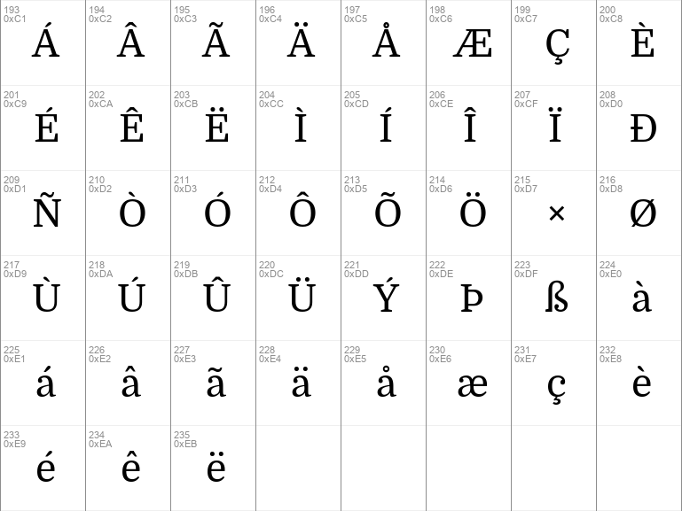
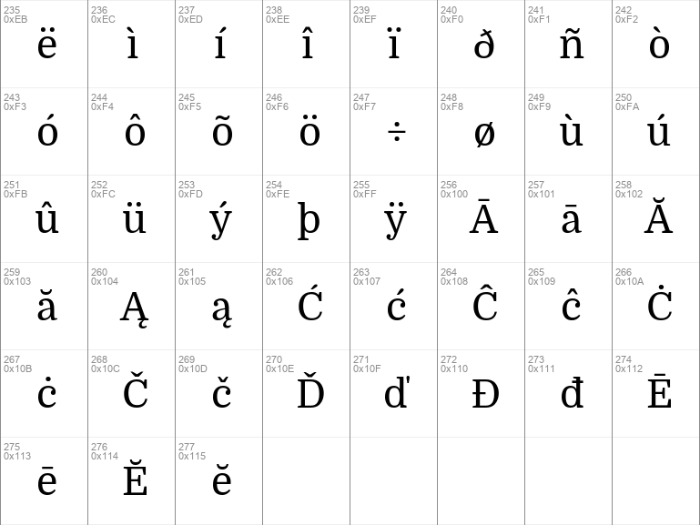
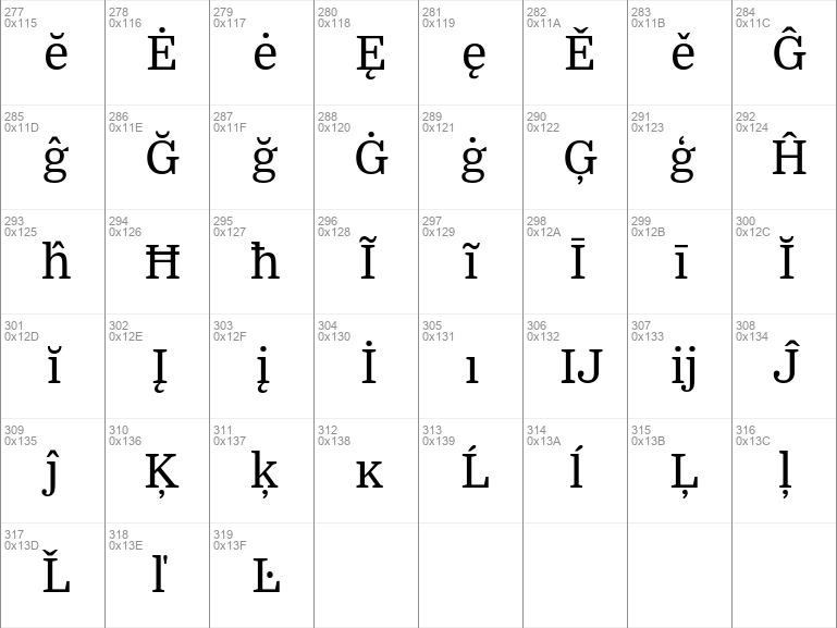
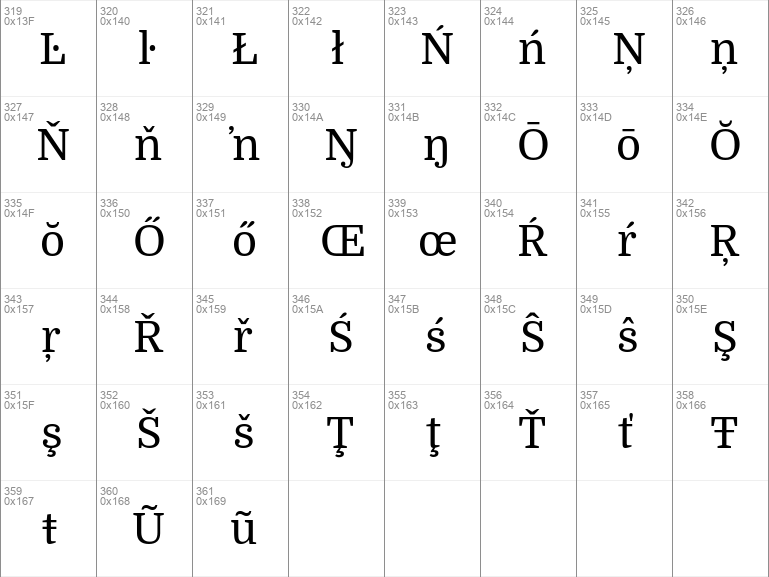
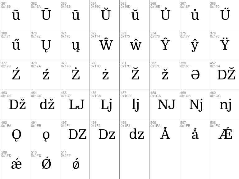
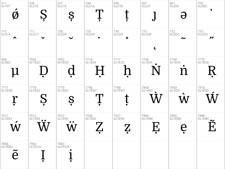
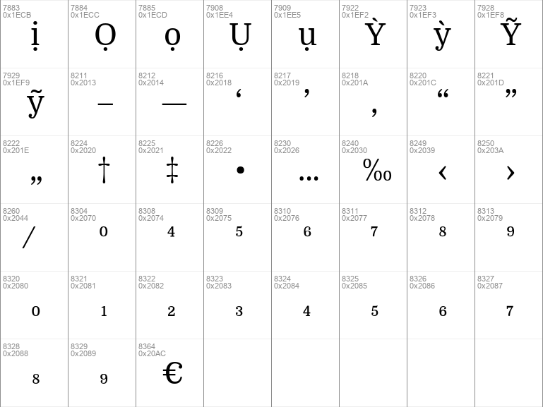
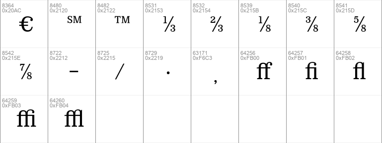
Image Demo


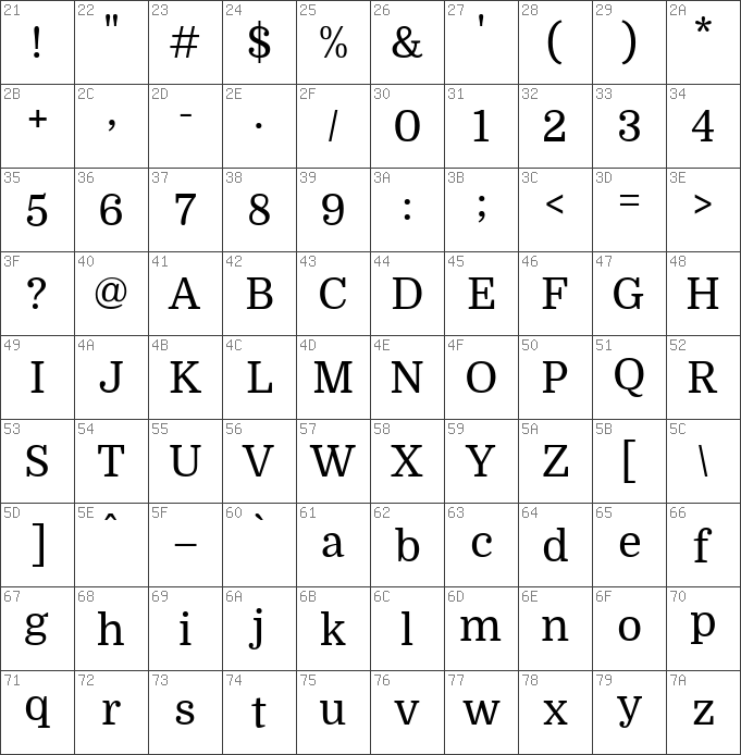
Domine Regular | Domine-Regular.ttf
- Font family: Domine
- Font subfamily identification: Regular
- Unique identifier: PabloImpallari, RodrigoFuenzalida, BrendaGallo: Domine: 2012
- Full font name: Domine
- Version: Version 1. 000; ttfautohint v0. 93 -l 8 -r 50 -G 200 -x 14 -w "G "
- Postscript font name: Domine-Regular
- Trademark notice: Domine is a trademark of Pablo Impallari
- Manufacturer name: Pablo Impallari, Rodrigo Fuenzalida, Brenda Gallo
- Designer: Pablo Impallari, Rodrigo Fuenzalida, Brenda Gallo
- Description: From the very first steps in the design process 'Domine' was designed, tested and optimized for body text on the web. It shines at 14 and 16 px. And can even be used as small as 11, 12 or 13px. Harmless to the eyes when reading long texts. Domine is a perfect choice for newspapers or magazines websites, where text is the main focus. It's is friendly in appearance because it combines the classic elements of familiar typefaces that have been in use from more than 100 years like Clarendon, Century, Cheltenham and Clearface. - The rounded letters b, c, d, e, o, p, q are a bit squarish on the inside. This feature opens up the counters for better rendering and also make it look a bit more up-to-date than the classic typefaces previously referenced. - The serifs are a bit shorter than usual. Another feature that improves the rendering by allowing more "air " between each letter pair. - The joins of the stems to the branches in letters like h, m, n are deep enough to prevent dark spots, also improving legibility at small sizes. - The friendly lowercase 'a', with the curve starting from the bottom of the stem, is reminiscent of Cheltenham and Clearface. That soft curve is also echoed in the curves of the f, j, n, m and r. - The spacing is also optimized for body text on the web, clearly more open than that of typefaces made for print or for headlines.
- License: This Font Software is licensed under the SIL Open Font License, Version 1. 1. This license is available with a FAQ at: http:scripts. sil. orgOFL
#domine#regular#domine regular#regular font#domine regular font#download#free#download free#free fonts#download free fonts#sans#serif#sans serif#domine-regularttf#windows#ttf#domine-regular#pablo#impallari#rodrigo#fuenzalida#brenda#gallo#pablo impallari#rodrigo fuenzalida#brenda gallo#impallari rodrigo#fuenzalida brenda#pablo impallari rodrigo#impallari rodrigo fuenzalida#rodrigo fuenzalida brenda#fuenzalida brenda gallo#pablo impallari rodrigo fuenzalida#rodrigo fuenzalida brenda gallo#impallari rodrigo fuenzalida brenda#pablo impallari rodrigo fuenzalida brenda gallo
Comments (0)
Please login!